Javi's graphic spot
Wednesday, October 12, 2011
Action Car Shots
Ok i know I'm not in high school getting graded for this but i wanted to post things even though I'm not in class no more because I'm in college. My newest piece is a picture of my friends car and i just made it look more interesting and bad ass. Its a mixture of blending options and blurs and vignettes, its been it has been 4 months and a half since I've used photoshop so I think I'm still pretty decent still well enjoy and tell me what you think :).
Tuesday, June 21, 2011
Sad Skin week 19
I made a new texture photo like the wooden guy in the hoody...since i used the new version of photoshop (Cs5) it was easier to make in less time because certain tools and FX's were in more convenient location and its more organized...i used a lot of layer masks and blending options and one curve i like curves because it give a bright or lighten vibe once the image is complete...but this was my final result on my bad skin manipulation.
Wednesday, April 27, 2011
Floating Island Manipulation week 18
Monday, April 18, 2011
Logo tut. Week 17
I haven't posted any work in a while but I worked on this tutorial on illustrator, and it was my 1st design on the program never used it but it had an indesign feel to it. i didn't read the tutorial until it got to the colors part because it made no sense to me and also i on grouping certain pieces together, but these are my results to this tutorial.
Link : logo Tutorial
Link : logo Tutorial
Friday, February 18, 2011
Old winter day week 16
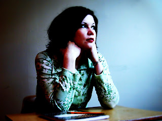
Ok all i did was change the make up the nail color the coats color and the coats fur used curves like on my last photo touch up on week 15, and i added a color and used the blending options and added a Gaussian blur and i used the masking tool to erase some sections of the picture to make her face and hand stand out more =)...so far i've been doing things free hand and out of my mind no tutorials and i keep improving! =)
class spot light week 15

Friday, February 4, 2011
paper art design week 14
Ok a new design i have made...so far Ive been having really bad artist block and its taken me a while to come up with a new design. i call this paper art design because it has an effect that makes it look like its all made out of paper and the lamp looks like its been drawn on it i used the pen tool to make that i just traced a photograph light stand that itself took me almost half a week to make the whole design took me a week and a half to make.it was tricky but i liked my final result..the only tutorial i used to make this was to make a torn paper effect the rest was my own skills i had obtained over the summer and senior year so far =)
Subscribe to:
Posts (Atom)


